SVETLANA SILKINA
Product Manager & Designer
.png)
Designing for Empathy:
Enhancing Chewy's Emergency Ordering Experience to Drive Loyalty
Summary
While Chewy's excels at fostering positive customer experiences, I identified an opportunity to enhance their ordering process for customers navigating sensitive or emergency situations.
My case study demonstrates how a more empathetic UX, tailored to these critical moments, can deepen customer trust, strengthen brand loyalty, and ultimately contribute to higher customer retention.
Deliverables
High Fidelity Figma Files
Client
Role
UX Researcher & Designer
Tools
User Experience 3 class
Figma
Adobe Photoshop
AI
.png)
Goals & Objectives
Research Activities
Goal 1:
Enhance User Satisfaction
Metric:
Satisfaction Rating (via user feedback)
Goal 2:
Improve User Loyalty & Retention
Metric:
Churn Rate (returning users)
Opportunity Workshop:
Defined project goals, success metrics, and initial problem scope.
User Journey Mapping:
Visualized the end-to-end prescription ordering process from the pet parent's perspective.
Review Analysis:
Synthesized existing user feedback and reviews (e.g., app store, website) to identify recurring pain points.
Key Findings & Insights
"Chewy's made a bad situation worse... there was no accountability, and I'm fearing for the life of my pet." ~ online review
Critical Transparency Gaps
User journey mapping revealed poor transparency and fragmented communication among Chewy, veterinary clinics, and customers in prescription ordering.
This opacity undermines accountability across all parties.
Emotionally Taxing Experience
The multi-step verification, combined with standard shipping times, creates a highly frustrating and emotionally taxing experience for pet parents, especially during emergencies.
.png)
Discovery & Research

Chewy’s ordering process for prescription medication lacks transparency between Chewy’s, the vet, and the customer. The lack of transparency allows each party to be held unaccountable for their step in the ordering process. The multi-step verification process combined with the standard shipping time leads to a time consuming and frustrating experience during a highly emotional time in a pet parent’s life.
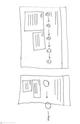
Create an “emergency lane” checkout for customers who are in the middle of a pet emergency to communicate that Chewy’s respects the seriousness of the situation. To create transparency and accountability, a progress bar can be viewed by all parties to showcase each step in the pharmacy verification process, with date and time stamps. Orders flagged as “emergency” are automatically given priority over pharmacy orders not required for an emergency.
Solution
Ordering Task Flow
Ideate
Simplify with open communication and trim unnecessary steps
Design Iteration & Testing
.jpg)

v.1 Baseline
Insights
-
Empathy Connection is extremely low
-
First Step and Previous Step in progress bar are designed for more attention than the current step
-
Next Step Info has more attention than the Current Step Info
Adjustments
-
Changed order confirmation message to be more empathetic
-
Adjusted message typeface to be more friendly
-
De-emphasized previous steps in progress bar by decreasing sizing
-
Added color and a bold border to emphasize current step in progress bar
v.2 Empathy Achieved
Insights
-
Empathy increased from 1.4% to 25.0% attention
-
Current Step receives the most attention in progress bar
-
Current Step Info receives more attention than Next Step Info
-
Focus score is low at 62
Potential Adjustments
-
Refine the progress bar's visual hierarchy. The current design needs clearer distinction between the active, completed, and pending steps to improve user clarity and reduce cognitive load
-
Should there be a higher attention difference between the info for current and next steps?
-
Instead of splitting attention equally across the page, design a top-down visual "funnel" to guide user attention more effectively and increase the Focus score.
Evaluation
Impact: UX
My UX solutions significantly boosted task success rates and user satisfaction for pet parents. By prioritizing empathy and transparency in the emergency ordering flow, we transformed a frustrating experience into one that builds trust and provides crucial support during emotional times.
Impact: Business
Beyond user satisfaction, our UX enhancements delivered clear business gains. We project increased customer satisfaction, a rise in return visitors, and higher transaction volume for critical needs. This strengthens brand loyalty and contributes directly to Chewy's long-term growth and customer retention.